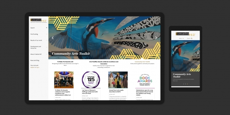
Creative New Zealand encourages, promotes, and supports the arts in New Zealand for the benefit of all New Zealanders. Their new site offers beautifully streamlined and personalised content which improves the quality of artists’ funding applications.
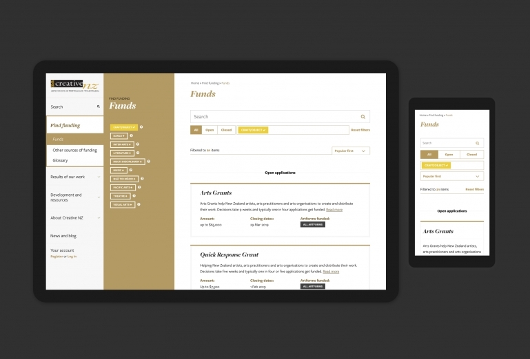
Supporting artists
Creative New Zealand (CNZ) provides funding, capability building, international programmes, and advocacy for NZ art and artists. Arguably, the most important function of the website is to provide information about the financial support for emerging and established artists, and organisations. CNZ communicates directly with design-savvy audiences — a tough crowd of critics — and needs to deliver mobile-friendly, authoritative content. Furthermore, CNZ’s own visual identity and branding must support and promote other identities and brands, rather than compete with them.
Better proposals, a better experience
At times, CNZ can struggle to meet the demand for one-on-one consultations with the creative community — especially with those who need a lot of support when submitting proposals. We were asked to help artists improve the quality of their proposals, with less intervention from CNZ staff. Putting artists in touch with the correct individuals within the CNZ team, when they genuinely need help, was also a key objective.
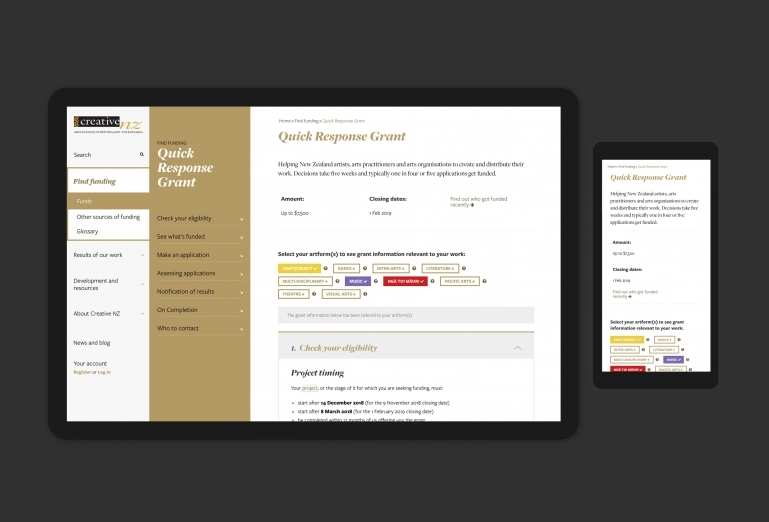
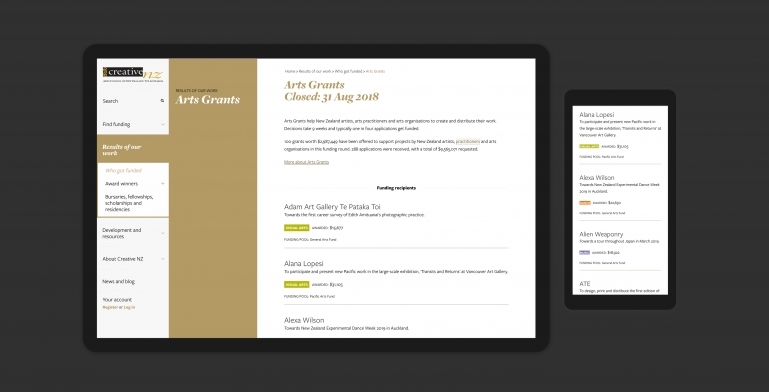
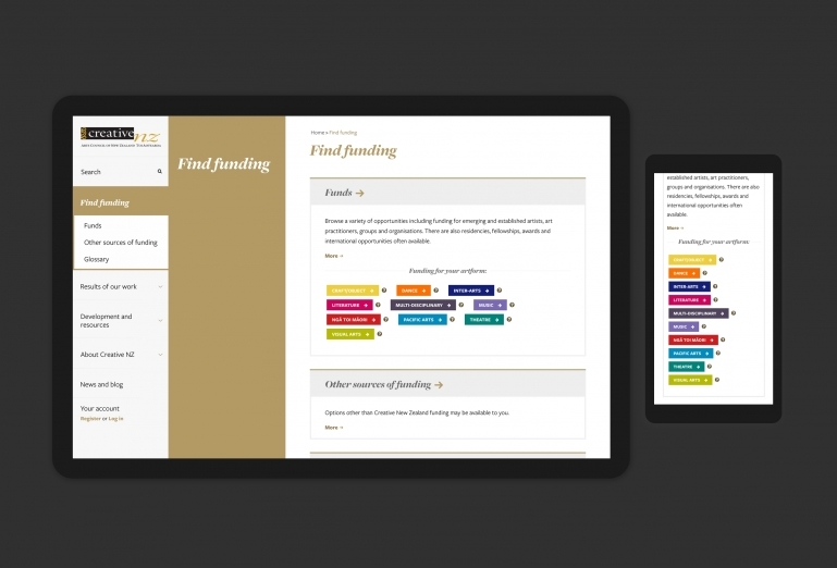
Meaningful use of colour
By differentiating art forms with colour — notably, the only use of colour within the user interface, other than gold, black and white — and by remembering the users’ artform preference, from the top-level Find Funding page down through all levels of the site, the content is personalised to individual artists.
Flexible, mobile-friendly design
Almost all content was rewritten and restructured in a way that allows for vast chunks to be turned on/off depending on the art form identified, and the device being used. Mobile-friendly accordioning of long pages provides super-quick navigation of otherwise extensive information.
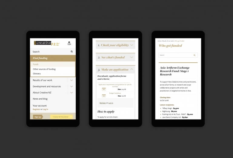
Clean and responsive
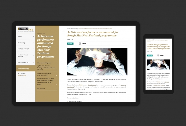
The site is largely sans imagery — a challenge for one of NZ’s most notable creative brands. The layout uses negative space and a strong typographic system to provide a prestigious impression, whilst remaining user-friendly. The semi-unconventional, and technically complex left-hand navigation system provides a touch of the unexpected — and to increase performance, is reused identically across all screen widths.
As many visitors use extra-large resolution screens (source: analytics), the site adopts a substantially different layout from mobile, through tablet and desktop — the latter being treated as generously as mobile, as far as ‘special treatment’ goes.

