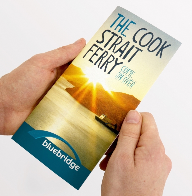
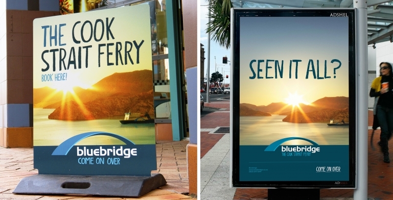
As the ‘underdog’ of the inter-island ferry market, Bluebridge had tended to follow the brand and marketing lead of their well-resourced competitor. It was time to differentiate, not emulate. The new brand and design system applies to every aspect of the company's business, from user-friendly bookings to engaging family fun.
Embracing the ‘gritty’ and ‘honest’
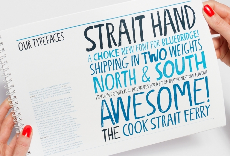
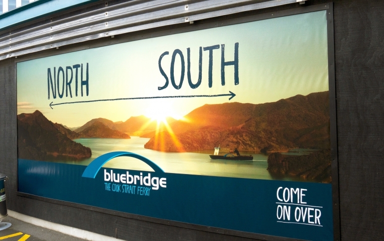
With our help, Bluebridge decided to change tack and work with what made them special — their no-nonsense honesty. Hospitality, friendliness, creativity, humour and a down-to-earth Kiwi-ness would become the brand’s defining qualities. The more personal and approachable visual signature was carried across all the brand’s marketing collateral and environmental graphics — including the website.
Their level of creativity and communication is second to none ensuring we’re always on the same page, resulting in some very impressive outcomes!
Michelle de Bono, Marketing Manager 2014–16
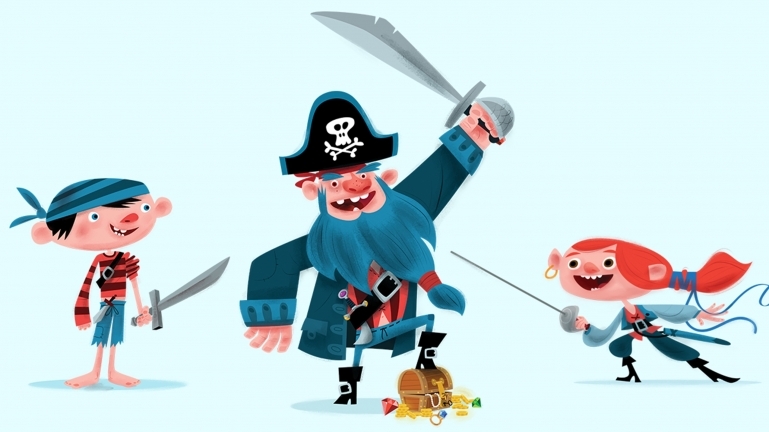
A cast of characters
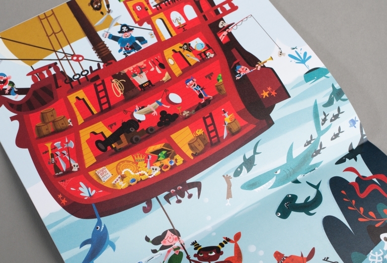
Equally important to the brand was capturing the hearts and minds of the family market. We collaborated with the talented illustrators at Teaspoon to create Bluebeard and his stinky crew of misfits. As a theme, pirates are not only cool and ‘on brand’ for Bluebridge, but were also able to light-heartedly deal with issues such sea-sickness, rough sailings, and the smelliness of some freight on board.
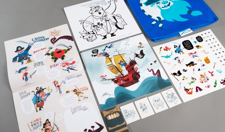
Fun-packed sailings
The kids' packs we created are given out free to every child that travels. And this is much more than some bog-standard, expected colouring-in placemat! These unique games, puzzles, activities and other giveaways are have been designed and crafted for the long trip and have helped transform a dull ferry ride into an awesome, swashbuckling, piratical adventure.
Clear, consistent wayfinding
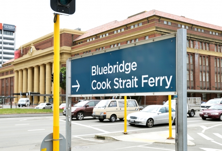
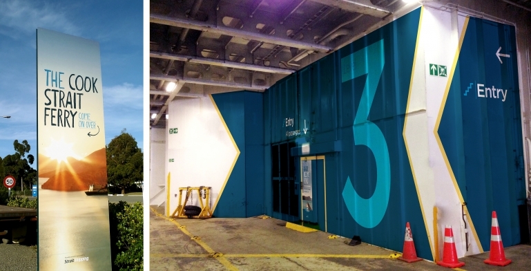
Alongside the new marketing and kids brand expressions we developed a more formal and direct style for wayfinding, with just a touch of the hand-drawn in its iconography. A jumble of mismatched and ambiguous signage throughout the terminals and onboard the vessels was replaced by a single consistent system — guiding the customer from the carpark entrance all the way to the coffee machine.
Booking front and centre
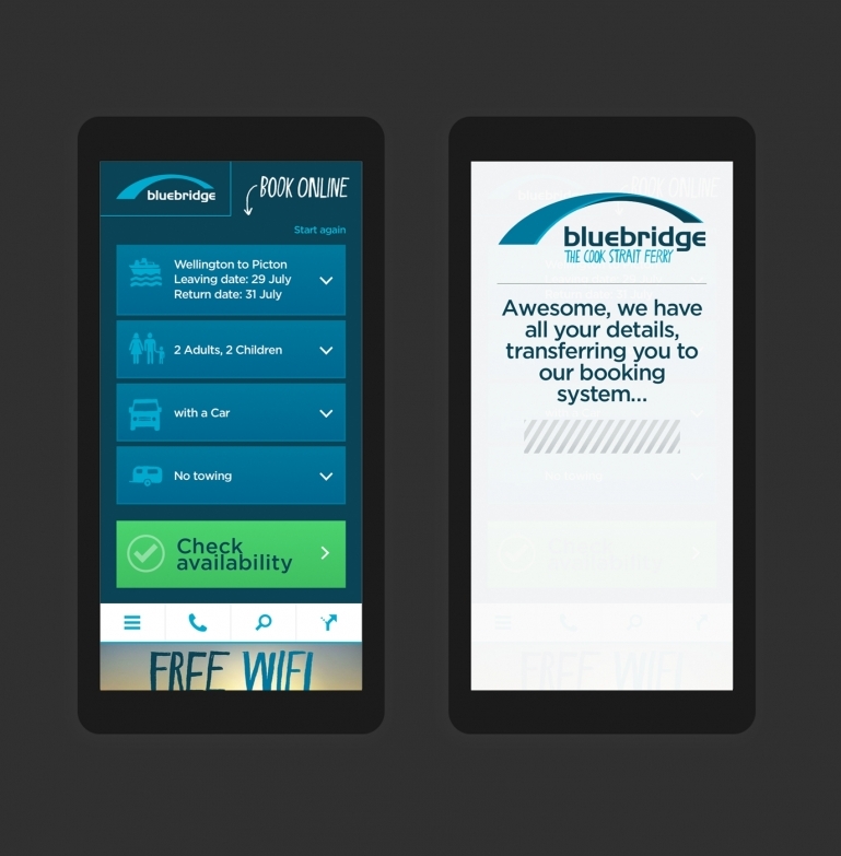
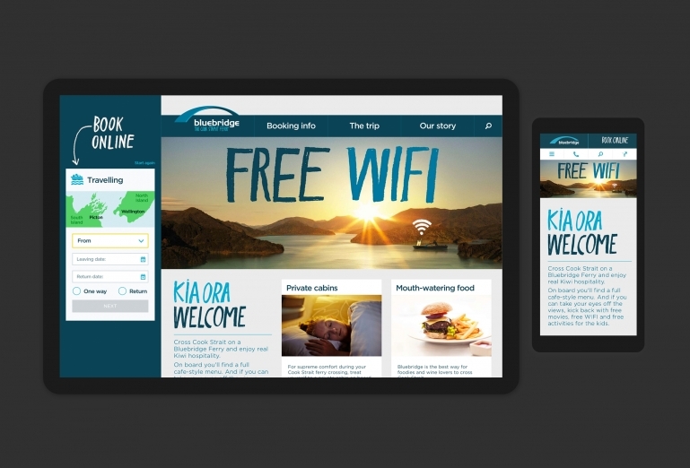
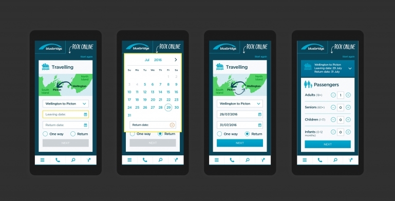
For Bluebridge customers, booking travel obviously needed to be the focus. The site was not responsive, making it terrible for 80% of those who book online while travelling. Our solution was to create an ever-present mobile-first booking widget, which hands-off to the 3rd party system at the last possible moment. The rest of the site is designed from the booking widget ‘out’, with all the supporting information and marketing material focused on encouraging booking.
Painless booking
The entire booking form is presented in one easy flow that begins with your direction of travel and clearly illustrates it. This deals with the number one call centre issue from foreign travellers who aren’t familiar with “North/South” or “Wellington/Picton”.
Having made their way through a customer-centric booking process, the details need to be transferred to the “operational” 3rd party system. To help reduce this jarring effect of this hand-over we created a deliberate, almost apologetic, pause to indicate this change in experience.
